About the blog:
On January 1, 2013, I started a daily design blog. I challenged myself to create something every day for 365 days. Random ideas, questions, design problems, etc. that I encountered throughout the day, were elaborated on. Working with the only rule that something must be posted by midnight, I enjoyed experimenting and exploring creative freedom.
Since the day I started this project, I have been learning and evolving. It was certainly a difficult project in which there were many days that I wanted to quit. I pressed on because I was dedicated to my goal and saw the value in it. With each day I learned to work faster and to view the days work as an experiment, rather than worrying about creating a final piece. It was frustrating to put things out there that I wasn’t totally satisfied with, but I understood that it was part of the process, and it propelled me to work harder the next day.
It was an exciting adventure in which I constantly discovered new skills I never knew I possessed. I learned a lot about myself along the journey and I am happy to finally share this work in a way that I am truly proud of. I encourage all to create your own significant nonsense and put your work out there in the world.
About me:
I am a designer who hails from the Boston area, now happily calling Chicago home. On my second day living in Chicago I stood in a crowded room full of AIGA Mentor Members, not knowing what the hell I was doing, but I was doing it. I was fortunate to find my way into the Chicago design community and be welcomed with open arms.
I thrive on these sort of new experiences and am always eager to collaborate with others and exchange ideas. I’m grateful to have had the opportunity to work alongside some amazing people in which I have gained a wealth of knowledge in many areas of design.
My interests lie in many places, which I believe greatly inspire my designs. When away from the computer you can find me exploring the city, diving into a good book, or making a mess in my studio/kitchen. If you’d like to send me a hilarious dog video, chat about new projects, or mainline some coffee together, shoot me a message.
Creating the website:
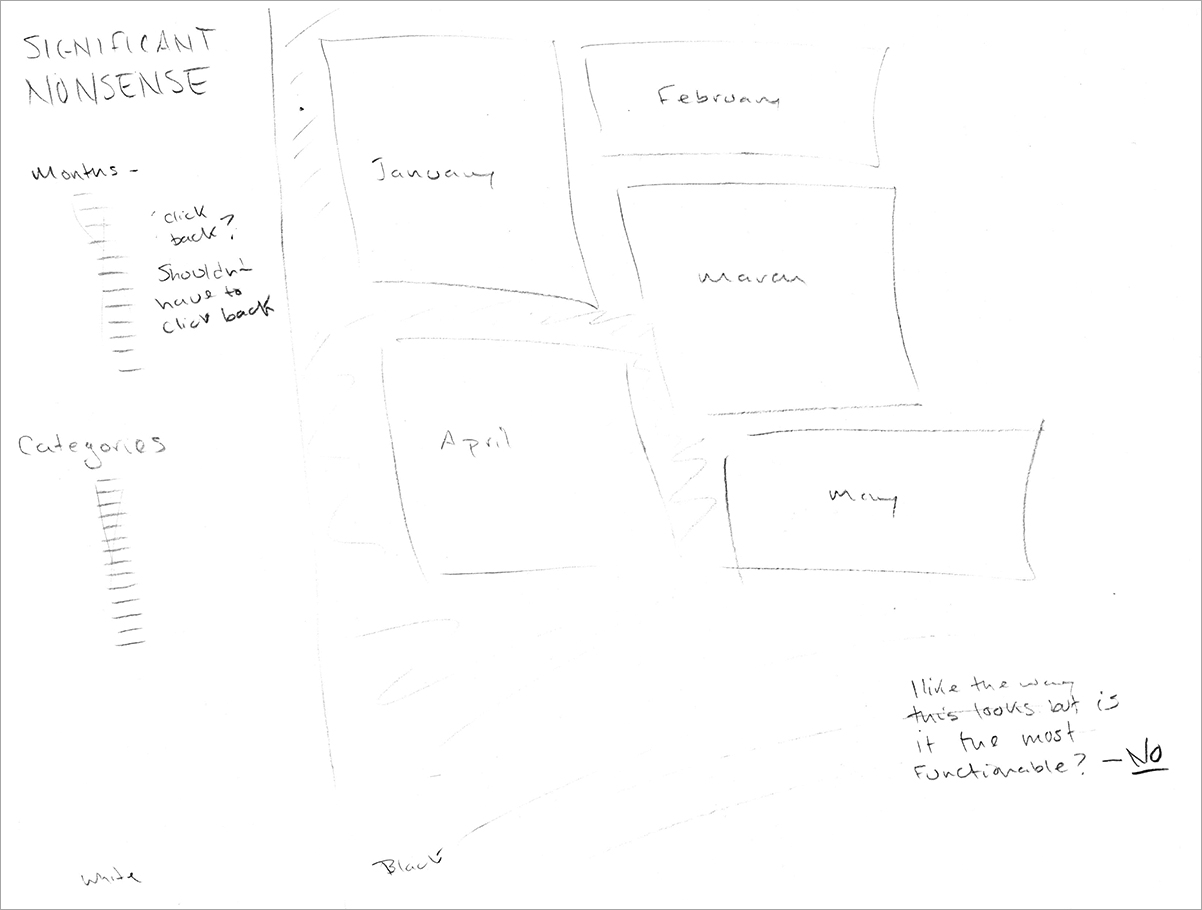
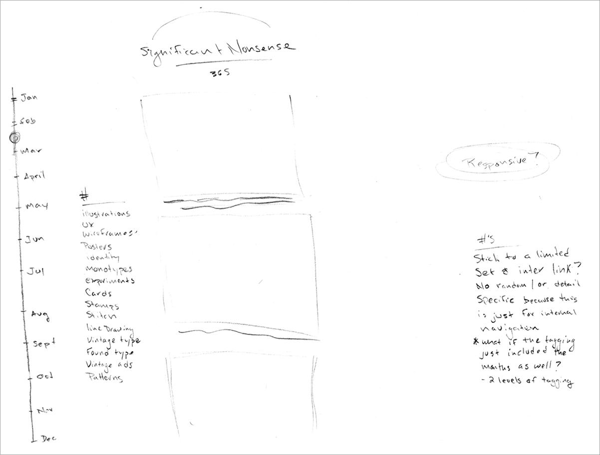
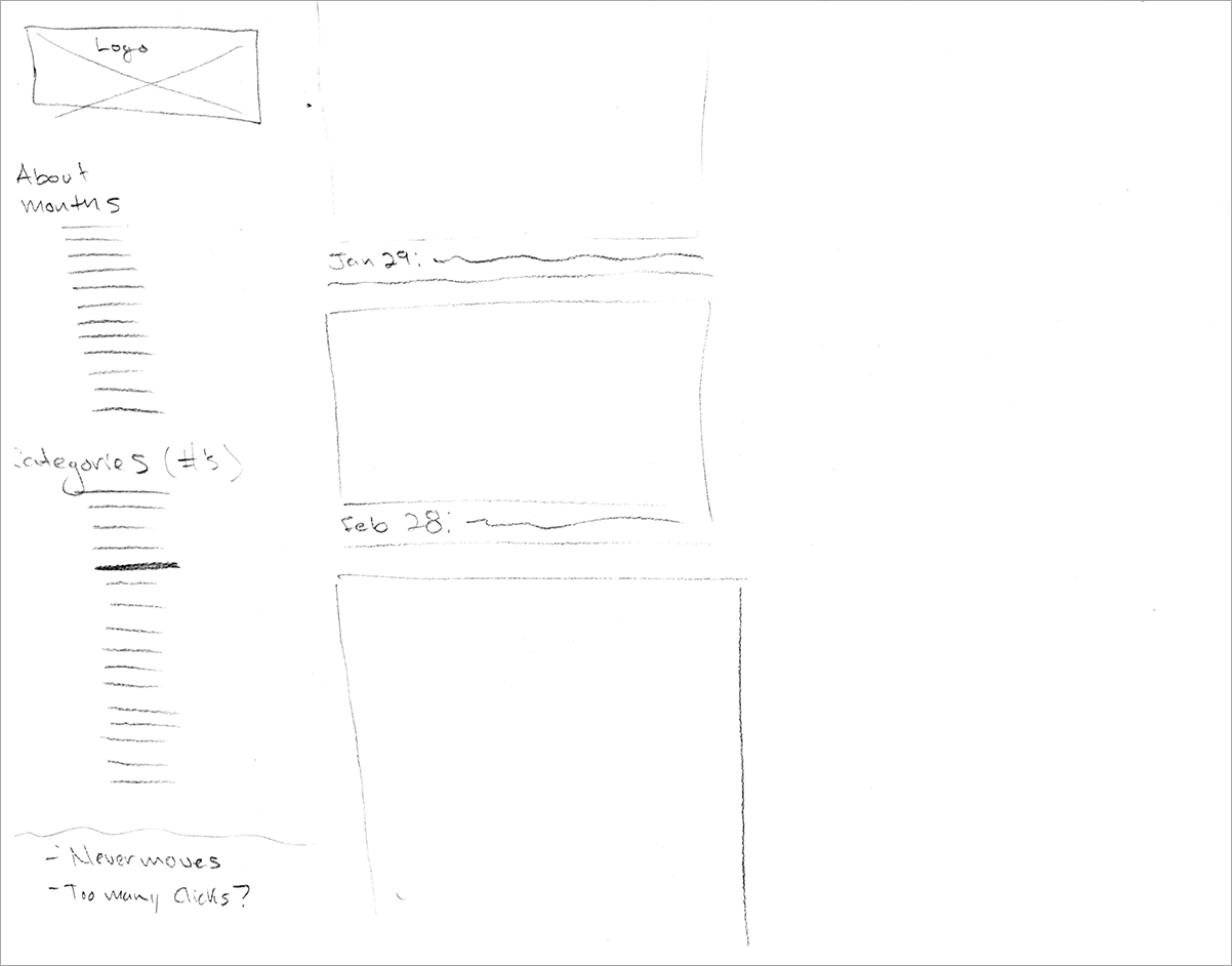
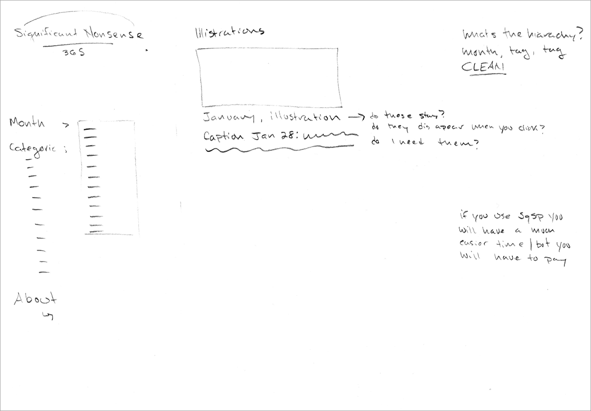
Since the completion of this project, I have spent a good amount of time trying to figure out how to showcase and organize the work. I felt that is was important to have two levels of navigation: firstly by month, to incorporate a sort of timestamp and show the progression, secondly by category to highlight some of the best work and show the variety of my interests in a more organized fashion. This in itself was a very difficult task. I did a lot of research, thought extensively about user experience, made many wireframe sketches, and took countless notes. After a lengthy process I finally had a good idea about how I wanted things to be displayed. That said; I still had a long road ahead of me.
One of the most difficult tasks was to resize the images. For the majority of the year, I was saving everything too small, so in order for the work to be seen optimally across all platforms I had to go back into the original (Illustrator, InDesign, Photoshop) files, to resize and resave. As you can probably imagine, this was a relinking, lack of file organization, nightmare.
As I traveled down the road there were many snags. I wanted the site to be mobile optimized and responsive, but I got about one day into coding it myself and realized it was going to be too large of a task. All of the features I wanted to incorporate where simply outside my level of knowledge, and though I am always up for a challenge, this one was looking quite daunting.
I redirected my energy into a Squarespace site and spent a lot of time exploring the templates and searching for the best way to display my work. By this point I had a pretty clear idea of what I wanted, therefore working within the confines of a template proved difficult. Originally I wanted to set it up so that the user could use sorting and tagging filters to view specific types of work. I also wanted to keep the clicks to a minimum, thus I was trying to be mindful of how the user would navigate throughout the site. I wasn’t able to completely accomplish what I had in mind, but I found a way to use the template to it's fullest. To be honest, I think the design I have landed on, which works with the limitations of the template, is much better that my original idea.
This body of work is very important to me and I am happy to finally share it in a way that I am truly proud of. I encourage all to create your own significant nonsense, put it out there in the world, and learn from the experience.


