
FOUND TYPE/DESIGN
I am constantly noticing beautiful typography and design everywhere I go. Mainly I find myself drawn to old signs and advertisements. Something about how they are crafted, the time that went into each piece, and the fact that they still survive and are equally as effective at conveying the message years later, is quite appealing to me. Over the year I photographed and blogged about many of the things I found that inspired me.

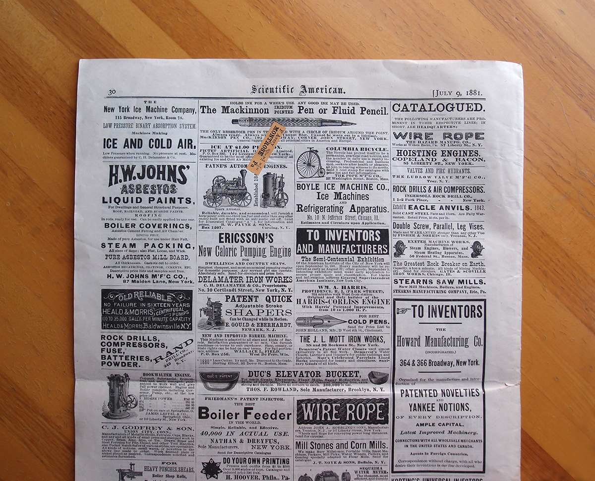


August 5: I found a bound volume of Scientific American magazines from 1897 at the Newberry book fair last weekend. Though I desperately wanted to purchase it, it was just too expensive, so I ordered a few single magazines online and they arrived today. Everything about these advertisements, from the typography to the raised ink, has me captivated.


May 25: Borrowing Lisa Congdon’s Collection a Day idea, I plan to shoot some of my own this weekend. Shown here is a very small sample of my keychain and pin collection (favorites and best design/typography).
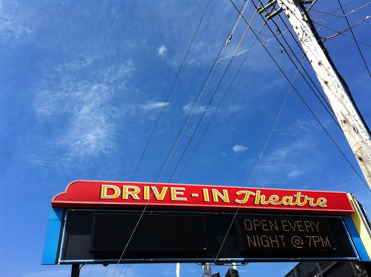
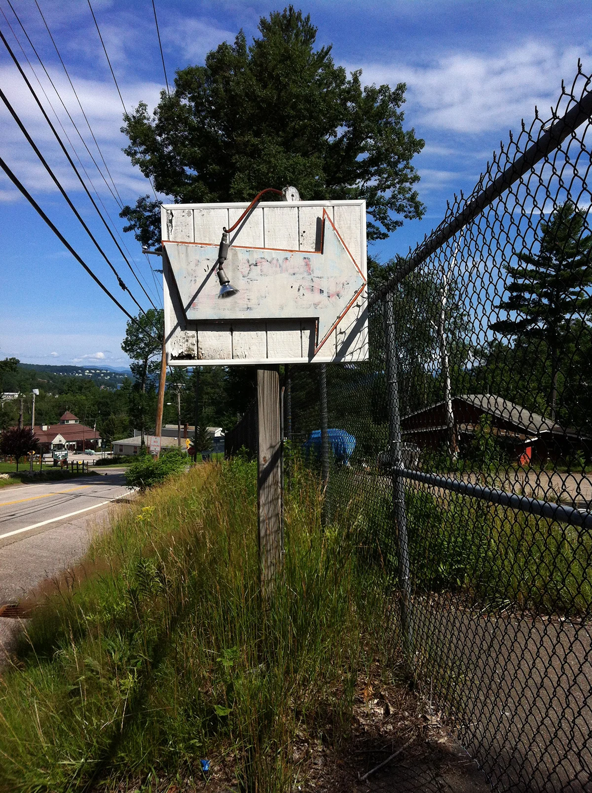
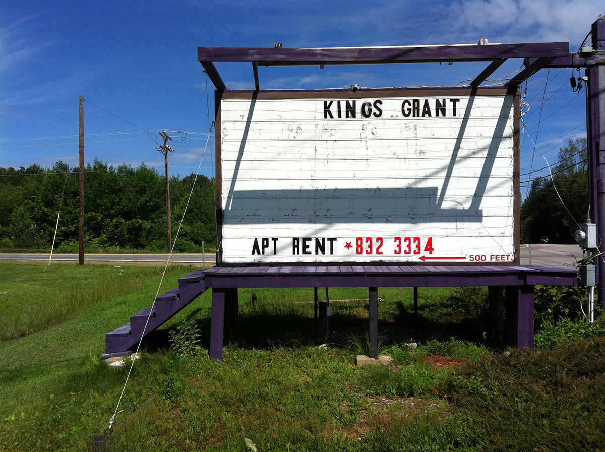
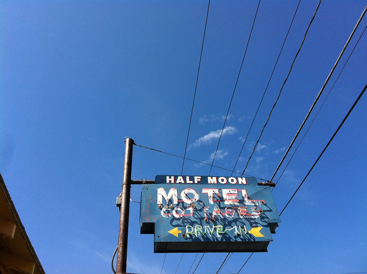
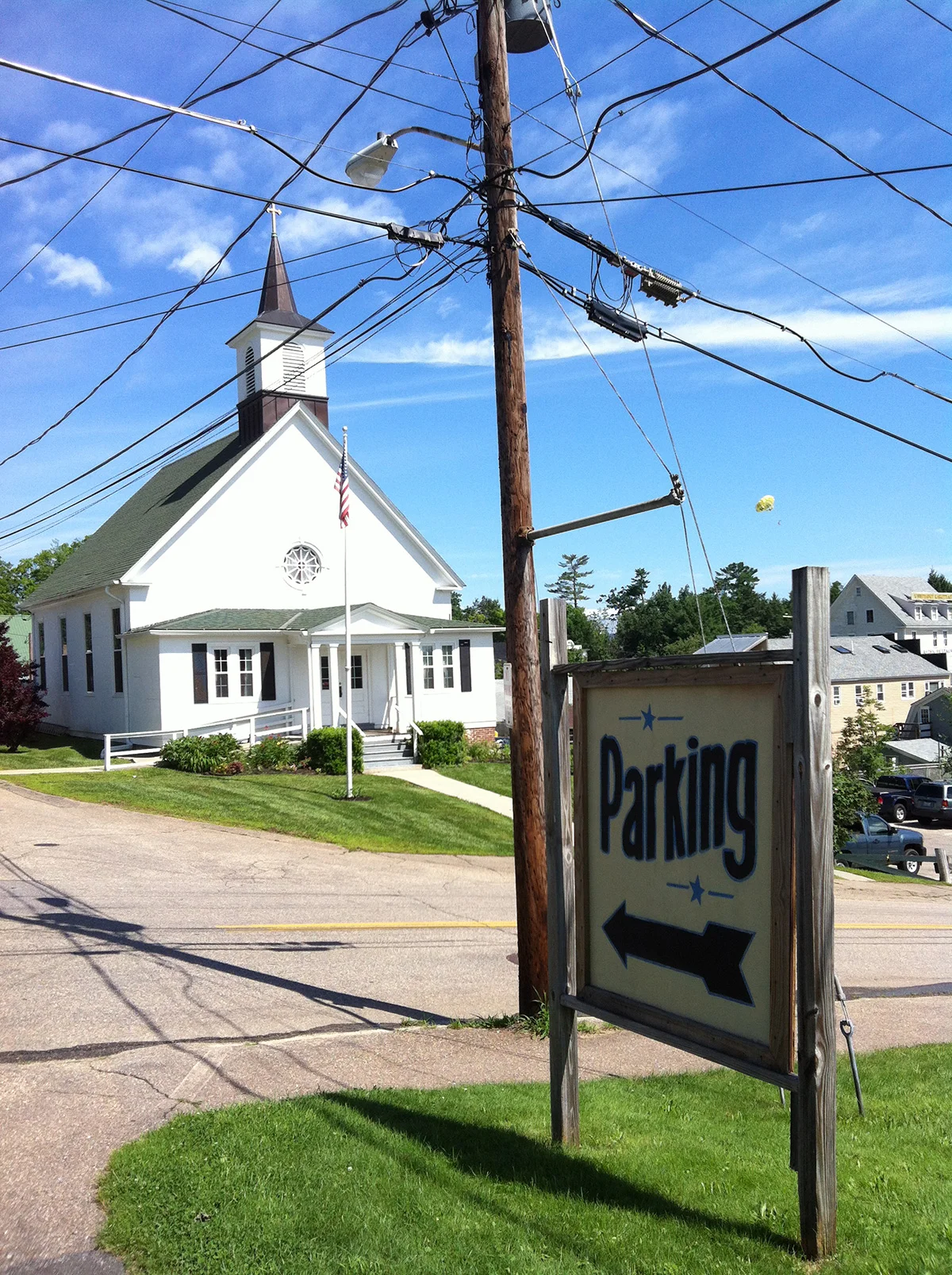
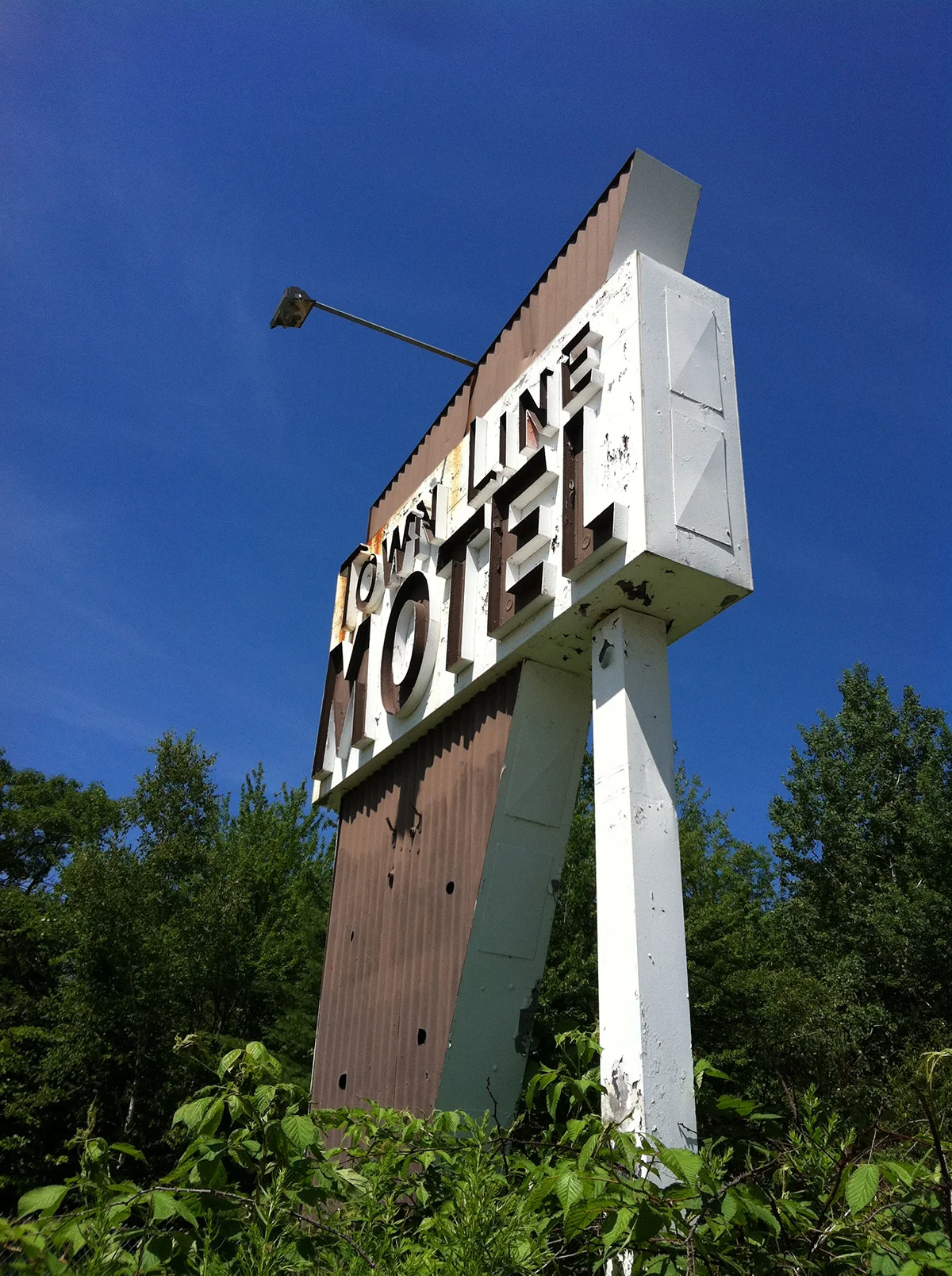
July 12: Some of my favorite vintage signs around Lake Winnipesaukee.
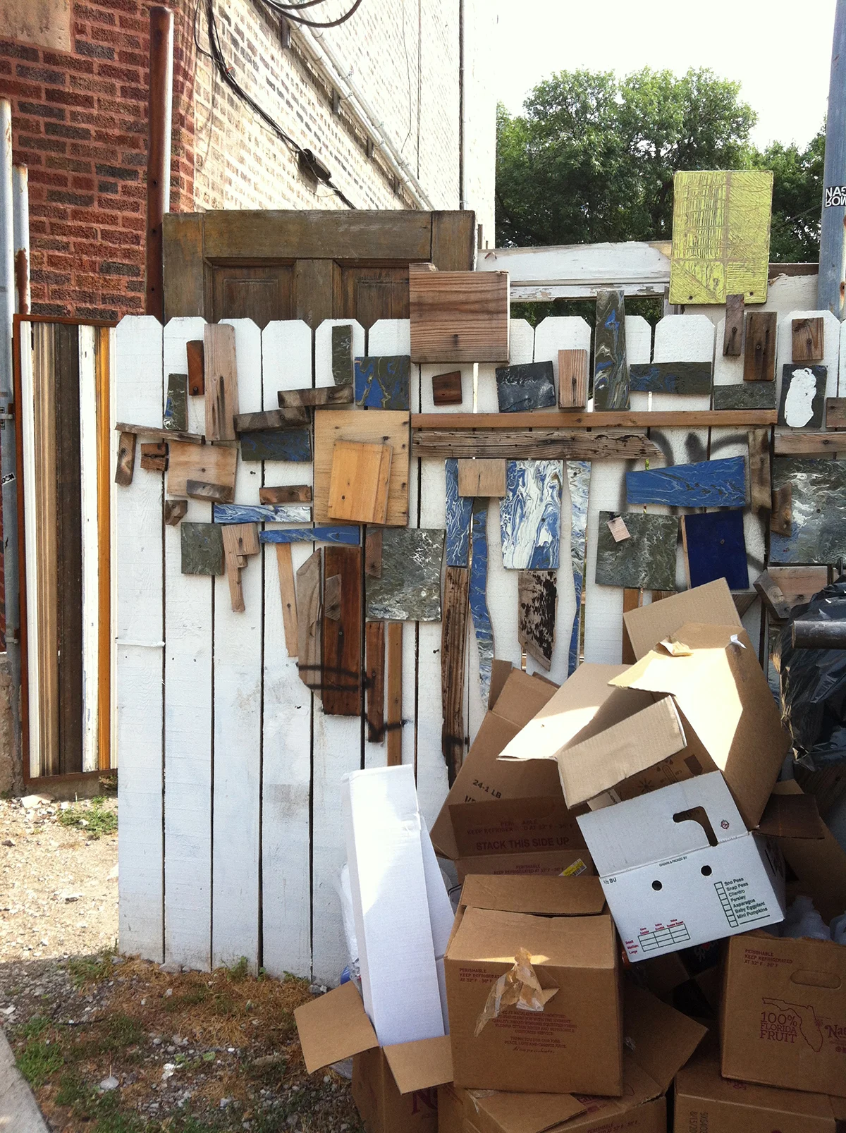
July 22: I have been noticing these wood installations sprinkled around the city since I moved here. I spotted this one yesterday on a bike ride and had to spin around for a photograph. The linear fence and pile of boxes add to it’s geometric composition.
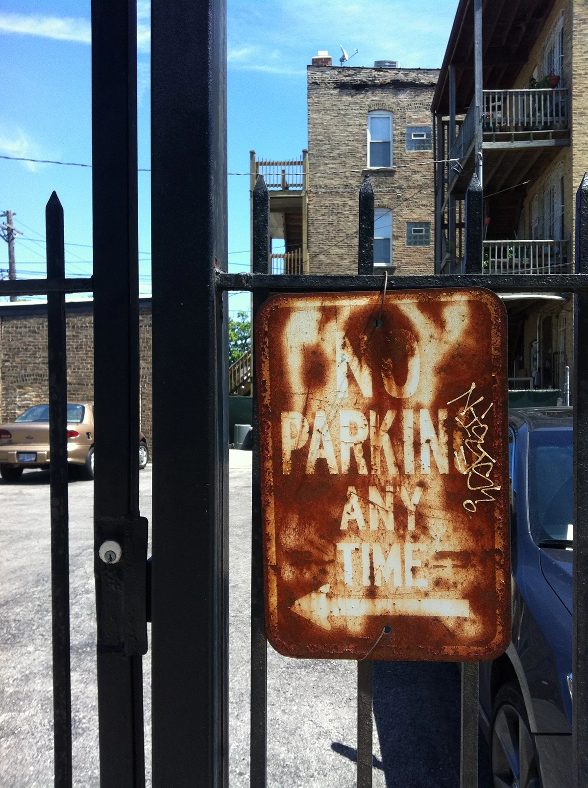
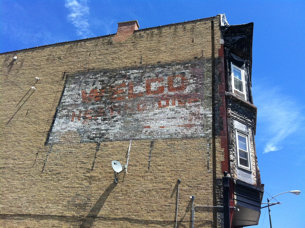
August 4: Finally stopped and photographed these decaying signs near my apartment. This weekend without a computer has been pretty enjoyable.


July 27: Found this super cool old newspaper, along with some other gems, at the Newberry book fair today. I am really diggin’ the ads, illustrations, layout, type treatments etc.

August 12: I really dig the ruler on the side of this stencil and I want to incorporate it into some sort of design. Not quite sure what it will evolve into, but we’ll see.


August 19: Back in Chicago after an inspiring weekend in Cleveland for Weapons of Mass Creation. I am just sitting down and going through my photos and other cool things I found, these are a few of my favorite signs I spotted along the way.


September 7: Went to the Harold Washington Library and let myself get totally lost in the stacks. I was looking for books on flowers, botany, vegetables etc. with a certain style of illustration. I had done a little searching on the internet, but had this vision in my head of what I was looking for and just needed to peruse some books. I had a general idea of where to start, but mostly just wondered around, judging the books by their covers, and eventually found what I was looking for.

September 2: I’ve recently been introduced to cold-brewed coffee (why I didn’t know about this before, I truly do not know) and as I was prepping tomorrow’s dose of caffeination, I again noticed this wonderful packaging. It is somewhat strange, yet I have always really enjoyed it, specifically that lowercase g, so I thought I would mess with it and see what happens.

September 14: Overwhelmed by the food options at Riot Fest. Rows of tightly packed booths with tacky vinal signs adorned with unappealing photos of greasy food and terrible typography and then this beauty sung out.


September 17: Inspired by the vintage circus design of Riot Fest, I did some library perusing and found these awesome books of old circus poster and such. Simply put, the illustrations and typography are amazing and I am exploding with ideas.


September 21: Spotted some awesome signs and weathered typography while exploring northern Illinois and Wisconsin today.


November 26: Found some sweet vintage designs while antiquing in Plymouth, MA. They just don’t make'em like they used to.


November 27: A couple of cool typographic finds I spotted while antiquing; I particularity like the toboggan crafted out of an old sign.
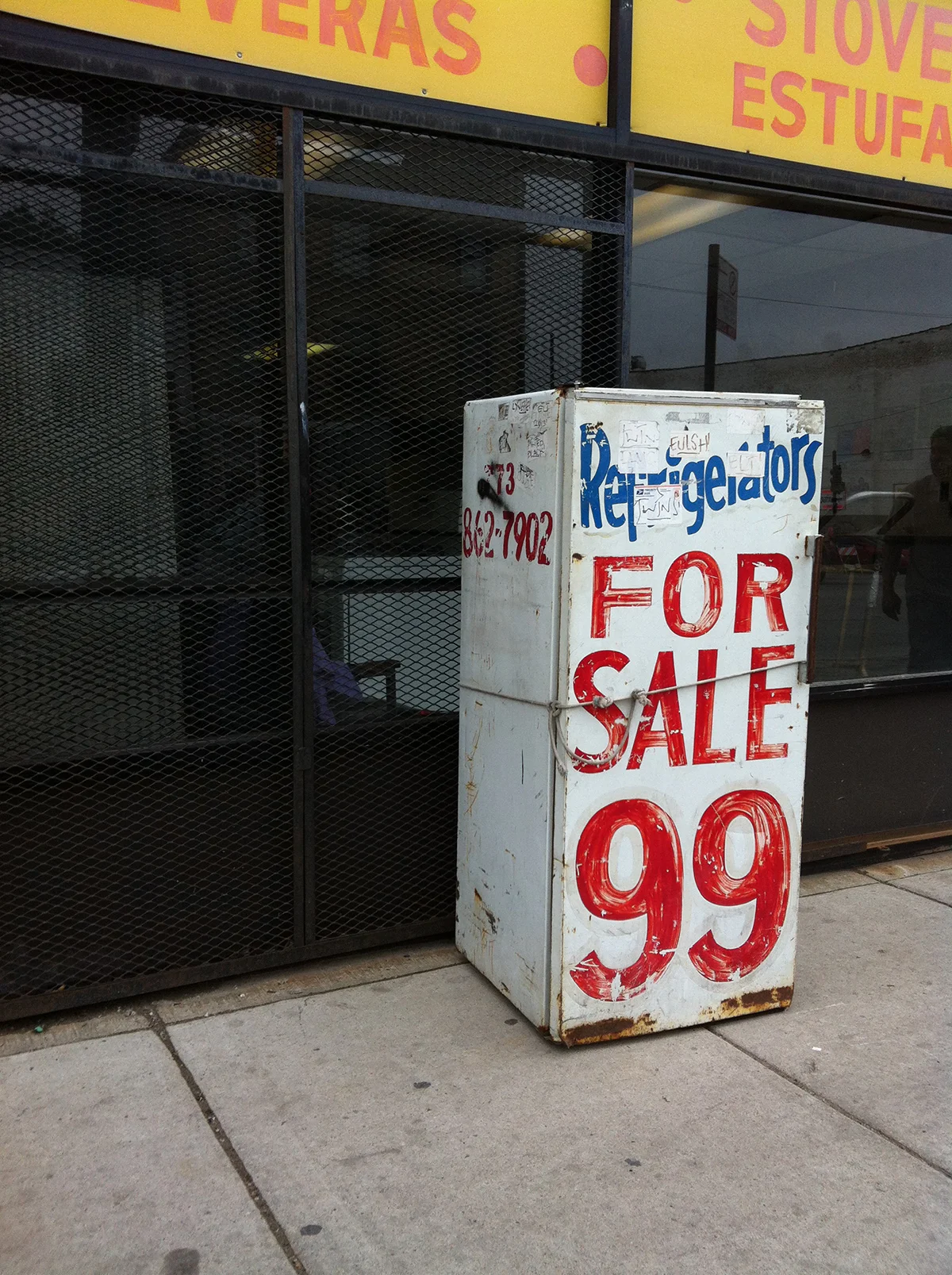


June 2: Took an impromptu walk home and finally photographed some of the amazing old signs, typography, buildings etc. along North Avenue. These photos certainly are not of the best quality due to the overcast sky and lack of camera, however I am glad I finally took this walk and captured these images.