March was an interesting month, I was creating some cool graphics and liking the direction the blog was heading. I had become very interested in user experience and responsive web design thus I was feeling an immense amount of pressure to redo my portfolio site to reflect my knowledge on these topics. At the time, my site was basic HTML/CSS, which I coded myself, but I found myself constantly fussing over the design of the site every time I went to upload a new piece of work. After a lot of research I decided to use a Squarespace template; the deciding factor was that they had really mastered the responsive aspect of their designs.
Once I had decided what I wanted, I realized that I didn’t have time to redo my site and simultaneously create new designs for the blog. I was having a conversation about this dilemma with a friend and he suggested that I simply blog about the process of creating the new site; he reminded me that it was my blog and that I could do whatever I wanted with it. This was a very valuable piece of advice that I revisited frequently throughout the year.
March 1: Finally bought F37 Bella, favorite characters: uppercase Q & lowercase g.
March 2: Playing around with an idea for a website layout.
March 3: Snapshot Submission: Explored a visual and typographical tone to compliment all aspects of the book. Sought a flexible voice that was structured yet playful.
March 4: Dribbble rebound, http://dribbble.com/chels-c-lee
March 5: Screen shot of my artboard.
March 6: Ampersands; 14 hrs of staring at a screen & this is my favorite thing I did all day.
March 7: Daily dose of nonsense.
March 8: In loving memory of a dear dear friend.
March 9: Graphic design since 1989.
March 10: Web layouts and how they translate on tablets.
March 11: Thinking about responsive design.
March 12: 99 red balloons stuck in my head.
March 13: Circles and lines.
March 14: A completely made up word, but I like the way it looks.
March 15: Don’t really know what this is, but I’m diggin’ it.
March 16: Playing with design elements from the past few days and really enjoying the outcome.
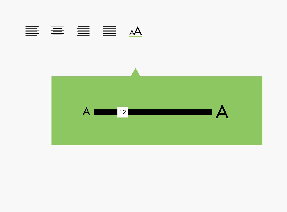
March 17: This is a Dribbble rebound (dribbble.com/chels-c-lee). A rebound is a shot in reply to another shot, which allows players to riff off an initial concept to get their takes on the same idea. This is my concept for a font size tool.
March 18: Linear map of Wicker Park.
March 19: I am in the very early stages of creating an entirely new portfolio website, so I have been sketching some rough wireframes and perusing the web for ideas.
March 20: New site layout concept; getting a feel for what I want before I dive in.
March 21: Another new site layout idea.
March 22: Happy Birthday David Laskowski!
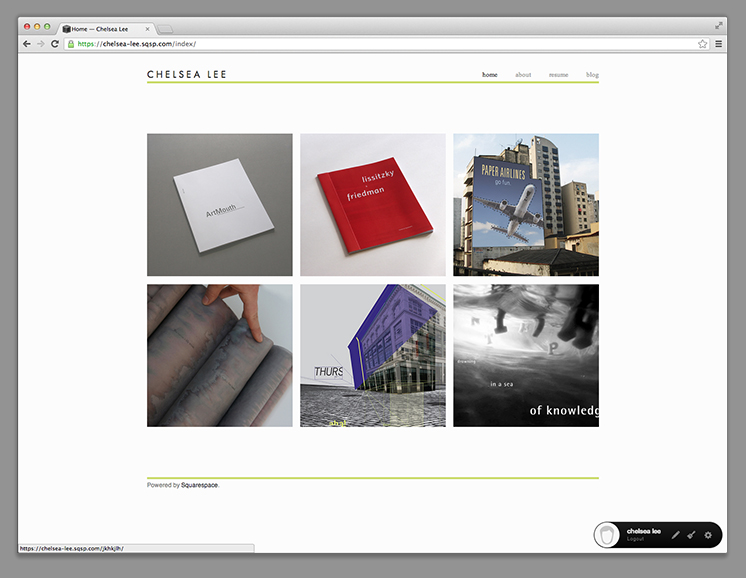
March 23: Decided to build my new site with Squarespace, mainly because they seem to be at the forefront of responsive site development. Here is what I’ve got thus far. Still have a lot of exploring to do with the features and style mode.
March 24: Day two of building my Squarespace site. Lovin’ the responsive design, specifically how the top nav nests under the 'menu' button when the browser window is smaller or when it is viewed on mobile devices.
March 25: Lists: cross one thing off and add 5 more.
March 26: I’ve now spent quite a significant amount of time trying to figure out how to add that green hr at the top of the page. After much frustration I decided to just paint it in, in Photoshop, so I could post about what I have been working on and wouldn’t ya know, I like it better without. Guess that’s what this blog is all about.
March 27: Thanks to the Squarespace support page, I finally figured it out! Decided to go with a neutral gray rather than the bright green.
March 28: Fixed all the little things tonight, almost ready to go live.
March 29: Preparing to reshoot my about photo.
March 30: Today I participated in the build a responsive resume workshop at the Harrington College of Design.
March 31: Finally my new site is live. Now just need to figure out how to point it to my url and make a few small adjustments.
April 1: A very productive week (thought I'd include April 1st here as it goes along with my website project).


